In the past few years, data visualizations have become a prominent feature of news reporting.
From Reuters’s interactive stories to The Washington Post’s widely shared elections map, newsrooms are increasingly using data-driven visuals to present datasets, verify information, and explain complex events. These charts and interactive visualizations help journalists turn complex data into clear stories readers can explore, share on social media, and understand at a glance.
How data journalists tell stories has evolved over time. The following insights help explain the tools, workflows, and visual approaches shaping the future of data storytelling.
How Did We Get Here?
Journalists have always relied on data to inform their reporting, but early visualizations were rare and experimental.
Long before interactive maps and dashboards, pioneers like William Playfair were creating statistical graphics, including some of the first line and bar charts in the late 18th century. This helped audiences see patterns in trade and economic data that were previously hard to grasp from tables alone. Below, explore the growth of data journalism through time.
Although data in the news is nothing new, we’ve seen an explosion in information and tools to help interpret that data. Data-driven journalism is no longer a nice addition to a publisher; it’s a necessity. Readers don’t only want to know what happened at a certain place at a particular moment in time — they want to be able to understand and explore the context behind that moment.
In recent years, the volume of digital information created, captured, and consumed around the world has skyrocketed.
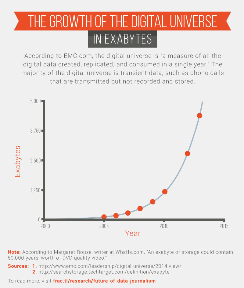
In 2023 alone, about 120 zettabytes of data were generated globally, with total data volume reaching 181 zettabytes (or 181,000 exabytes) in 2025. This scale is the result of decades of growth in data creation, replication, and consumption driven by connected devices, social media, streaming, and sensors.
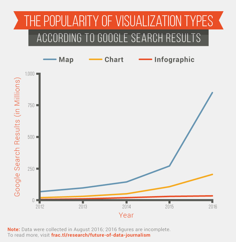
This increase, which shows no signs of slowing down, has been matched by an explosion in charts and maps. In 2012, there were 68 million Google search results for “map.” Between January 2016 and August 2016, there were 850 million results.
Data and data visualization are ubiquitous and here to stay.
Popular Data Visualization Tools in Newsrooms
Modern newsrooms rely on a mix of data visualization tools and chart types to turn datasets into clear, data-driven stories. The right tool often depends on the type of data being analyzed, how interactive the visualization needs to be, and where the chart will ultimately live. For example, it could be embedded in an article, shared on social media, or used as part of a larger investigative project.
Many journalists work directly with spreadsheets, CSV files, and public data sources before moving into visualization tools that support interactive charts, maps, and animations. These platforms help data journalists move from analysis to publication quickly while maintaining accuracy and editorial control.
Common chart types and tools used in newsrooms include:
- Bar charts and line graphs. These are among the most widely used charts for journalists, especially for comparing categories or showing trends over time. Tools like Datawrapper, Flourish, and Google Sheets make it easy to visualize this type of data clearly and embed charts directly into articles.
- Interactive maps. Frequently used in political, climate, and public-health reporting, interactive maps allow readers to explore geographic patterns at a local or regional level. Newsrooms often rely on custom JavaScript libraries or APIs connected to mapping data to support this work.
- Dashboards and multi-chart views. For ongoing coverage or investigative reporting, dashboards help journalists monitor datasets and surface key insights. Platforms such as Tableau or custom HTML-based dashboards are commonly used during the data analysis phase, even if only select charts are published.
- Infographics and visual summaries. When stories need to be shared quickly or understood at a glance, journalists often turn to infographics created with tools like Canva or ChartBuilder. These visuals are especially compelling for social media distribution and mobile audiences.
- Custom and open-source tools. Some newsrooms build interactive visualizations using open-source libraries such as JavaScript frameworks or Python-based workflows. These approaches offer flexibility for complex datasets, animations, and highly customized interactive data experiences.
These tools and chart types support the data journalism workflow, from data cleaning and analyzing data to fact-checking sources and publishing interactive visualizations that help readers better understand the story behind the numbers.
Thoughts From Data-Driven Content Creators
To learn about data visualizations from the people who wrestle them into stories every day, we had candid conversations with seven data-driven content creators about their process, where they get their inspiration, and what they think lies ahead for the field.
We spoke to:

|
|
We picked their brains about the future of data-driven visualizations. We also used the opportunity to get a closer look at how they work and where they look for inspiration. (Note: their words are lightly edited)
How Do You Create Quality Content?
Creating high-quality, data-driven content isn’t about following a single formula; it’s about balancing storytelling, technical skill, and experimentation.
Allison: We do most of our work in [programming language] R using the ggplot library, and then we tweak our designs a lot. I don’t know if anyone spends as much time on Illustrator as we do.
Katie: I really let the data lead. My background is quantitative. If I get in with the numbers, I can internalize that quickly. I can see the takeaways and the story.
Matt: Instead of figuring out the story before we design, we lean toward data exploration first. We prototype visualizations during analysis.
Nathaniel: We put the story first, rather than the technology. We have people who are flexible with the technology, and our process is very iterative so that we can tell a story worth telling. We also think about every bit of the process that you, as a reader, are going through and make each piece of the visualization count.
Ryan: We have an internal culture of trying new things. Whether it be how we collect the data or the topic of the content, our team makes it their mission to innovate. We also don’t tend to harp on a failed idea. Like the startup idea of “failing fast,” we learn from our mistakes and pivot until we are successful.
What Sites or Other Resources Do You Look to for Inspiration?
When it comes to sparking ideas, this group casts a wide net, from top-tier journalism and pioneering designers to niche forums and visual inspiration platforms.
Allison: The New York Times sets the benchmark for what is possible. Jennifer Daniel, my former boss at Bloomberg Businessweek, is highly creative and now an editor at the New York Times*. There’s also Nigel Holmes, a long-time editor at Time. He has a really illustrative style, which some consider “chart junk,” but I like him.
*As of January 2026, she’s now a creative director at Google
Andy: Newspapers are at the core of the very best practices in this field, such as The New York Times, South China Morning Post, and the Financial Times. Nathan at Flowing Data also continues to do an amazing job tracking the latest releases from across the field.
Katie: My design collaborators who have more of a visual background, and there’s a few people out there who are good aggregators, including Jan Willem Tulp and Giorgia Lupi.
Kristin: The New York Times data blog and The Upshot all create great content. Reddit’s r/dataisbeautiful and r/datasets are also good places to go for inspiration.
Matt: I look at specific people’s work, including Gregor Aisch, Adam Pearce, and Amanda Cox. Tony Chu is also about to come out with really excellent work.
Nathaniel: I lean heavily on d3 visualizations. Blocks is a good one. Mike Bostock uses that as his way of demoing stuff. I also like Adam Pearce, at The New York Times, and a few other non-news developers, like Nadieh Bremer.
Ryan: I try to consume as much content as I can, and see what styles, mediums, topics, angles, etc., people are talking about on various social platforms. I especially love the data science community on Reddit (especially r/dataisbeautiful). If I’m working on a topic that I’m not too familiar with, I find it’s great to figure out where your audience is sharing and what they are talking about. I also frequently look at images tagged as “data” on Pinterest, Tableau’s Galleries, Behance, and Awwwards.
What’s Coming Next?
Although no one can predict the future, these content creators have their fingers on the pulse.
Katie: I have more of a wish list. I would love to see people’s personal data, like their electricity bill or their health data, presented in a way that’s clear and doesn’t require you to be super numerate in order to understand. This is starting to happen already.
Kristin: New and increasingly sophisticated tools are emerging that will allow us to uncover hidden aspects of data that we were never before able to see. Machine learning will certainly impact this field even more significantly than it ever has before.
Tools that bring data visualization technologies to the masses will become even easier to use and more intuitive. On top of all of this, we can expect more and more organizations, governments, and businesses creating public portals for their data as they realize the power of the crowd to find insights into public data.
Matt: Generally, we’ll see more data visualizations. It all comes down to better tools. Better tools lift the sea levels, and everyone’s ability improves. My outlook is positive.
Nathaniel: I’m excited for more intuitive and feature-rich tools that people with more of a design and graphics background can use without coding too much.
Ryan: In terms of visualization, we are already seeing the shift of static graphics to animated videos and GIFs. Social media has become the conduit for social sharing, and there has been a massive push toward videos and GIFs. I think many content creators have realized you can use data visualization as a way to tell the story within seconds. It also doesn’t hurt that our internet speeds are increasing, so more and more people can enjoy video content.
The Future of Data Visualization in Journalism
Looking ahead, data visualization in journalism is moving toward more interactive and reader-driven experiences. As data sources grow more complex and audiences expect greater transparency, journalists are increasingly building charts that allow readers to explore the underlying data themselves — filtering results, adjusting views, and seeing how conclusions were reached.
At Fractl, this same emphasis on clarity, exploration, and trust guides our approach to data-driven storytelling. Our team applies research, visualization, and narrative design across multiple channels, from earned media and search to social platforms and emerging GenAI experiences. We help data-backed stories reach broader audiences and deliver lasting visibility, and we’re excited to play a part in shaping the future of data visualization.